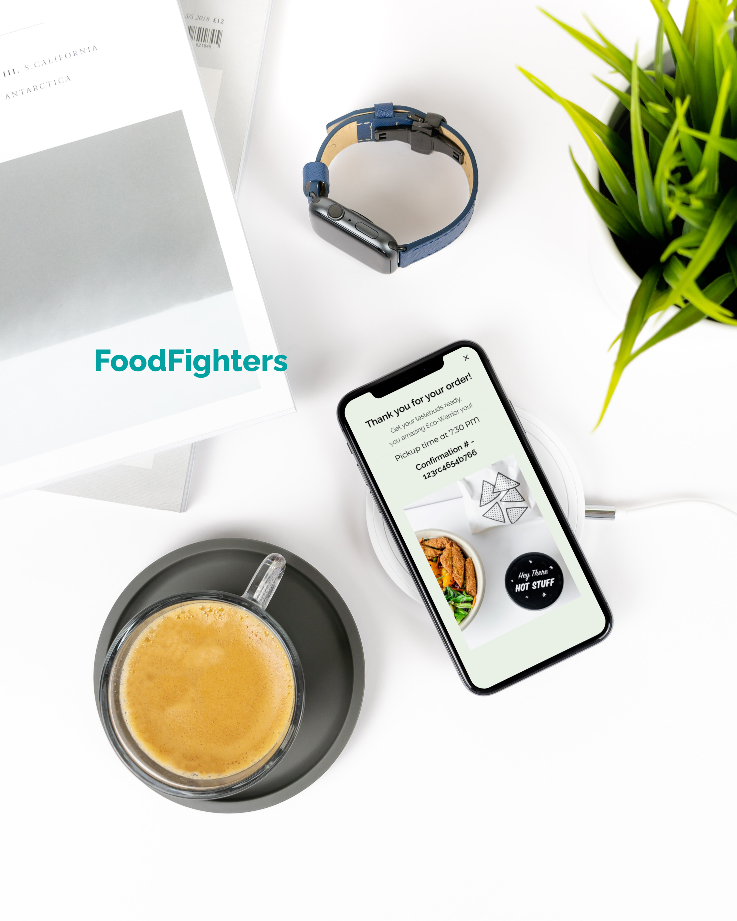
Food
Fighters
Designing a Food App Experience for a Better Tomorrow
Role:
UX Designer
UX Researcher
Content Strategy
Constraints:
3 weeks
Low-Fidelity
Tools:
Figma
Adobe Photoshop
Trello
Team:
Huong Nguyen
Niles Binns-Davis
Justin Peterson
Nolan Simmons
Gunnar Morgan
Senior Designer: Paulette Besa
Instructor: Sumera Ahsan Sheikh
The Story
Nicole approached our team with an amazing idea for a food ordering app that would champion sustainability and zero-waste. She was inspired by her travels to Europe where as a "broke college student" she searched for inexpensive food near her, and was directed to an app that connected budget-minded customers to restaurants with a surplus of food they hoped to sell at a discount. Nicole's vision is to bring a similar app to American markets to help curb the ever-growing food waste epidemic the country faces.

FoodFighters Story Board
Problem:
As a team, we wondered if we could build an app that provides services to both vendors and consumers that illuminate zero-waste business practices in a way that any US consumer can feel great about using, no matter what their stance is on food-waste and sustainability. We asked ourselves; 'how might we use America's food surplus to help feed sustainability-minded and budget-minded individuals?'
Solution:
Much to our client's delight, we successfully designed an MVP, low-fidelity food app that offered customers a simple and easy-to-use product with which to order inexpensive food from sustainable restaurants.
A Bunch of Good Apples
My Team and My Role
We worked as a team of 6 in weekly sprints. Each of us was responsible for leading a specific perspective of the project, but we all had a hand in the minute functions of each aspect of the research and design of the current prototype.
Although my perspective was primarily in content strategy, I was heavily involved in all other aspects of the project. My contributions ranged from:
Conducting user surveys, interviews and usability testing.
Leading the teams content strategy and contributing to overall team decision making for various elements of the project.
Sketching designs and giving my input for the wireframe; suggesting the floating tile carousel seen in the prototype.
Organizing and synthesizing information for the stakeholder and client presentations.
All in addition to my focus on the information architecture of the product and managing team productivity through daily meeting agendas and leading the daily stand up sessions.
“[Team Coffee Cats] was cohesive, proactive, and creative.”
– Nicole, Client
Finding the Right Ingredients
The Research

A whopping 61.4% of people surveyed see themselves as practitioners of sustainability.
Through user surveys and interviews, we learned that a great many of our participants view themselves as sustainability-minded and very budget conscious. A large majority also voiced a great deal of displeasure with other, difficult-to-use and costly food delivery and food purchasing apps. These insights greatly informed our design strategy for our app in that it focused our intent to create a simple, easy-to-use app that would quickly connect customers to restaurants offering good deals on their surplus inventory.
“Sustainability is important overall for the state of the planet.”
– Interview Participant
47.7%
68%
86.4%
Personas
Tony and Sara were personas developed from data collected through user surveys and interviews. Tony represents our budget-minded, millennial, young working professional audience. Sara represents our college-age, money-strapped, Gen-Z audience. Both groups are alike in that they are very budget conscious and consider themselves eco-warriors and/or very interested in sustainability.
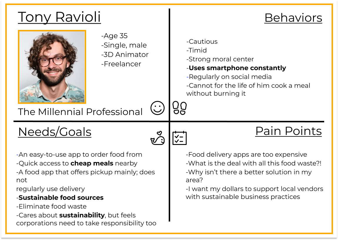

They differ in that Tony cares about sustainability, but also believes corporations should have responsibility for eco-friendly practices as well. Sara self-identifies as color-blind, and becomes frustrated when she encounters apps and websites that do not take accessibility and readability of content into account.
Putting (most) of our Eggs in one Basket
Defining the Problem
Understanding both our client's request for and our customers' need for simplicity, I led our team through an affinity map exercise to narrow down the key functions our app needed to provide in order to ensure an optimal user experience.
App Features Affinity Map
I then refined and streamlined the themes from the affinity mapping activity down into 4 primary functions necessary for our app. This is the final iteration of the site map, with the shopping cart listed as its own flow. I wanted to place an emphasis upon each specific function that the user would have access to within the app, but also address the varied choices available within each function for customers.

Site Map v.4
Customer Journey and User Flows

Tony's User Flow-Young Professional
Sara's User Flow- College Student
Into the Mixing Bowl!
Ideating
Our team prided itself on transparency of information amongst ourselves, as well as diplomacy in our decision-making. All final decisions that affected the design of the prototype were made as a team.
Our team prided itself on transparency of information amongst ourselves, as well as diplomacy in our decision-making. All final decisions that affected the design of the prototype were made as a team.
Wireframe Sketch
Progression of Wireframes to High Fidelity
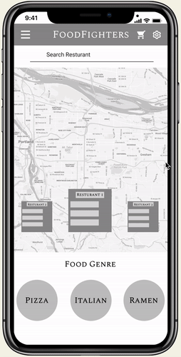
I implemented the restaurant tile carousel over the interactive map, along with the food genre circle icons that also carousel to provide customers various options to select their food choices.
I chose circles to appeal to our client's preference for the shape and because it symbolizes youthfulness, unity, and globalism; all qualities our app stands for.

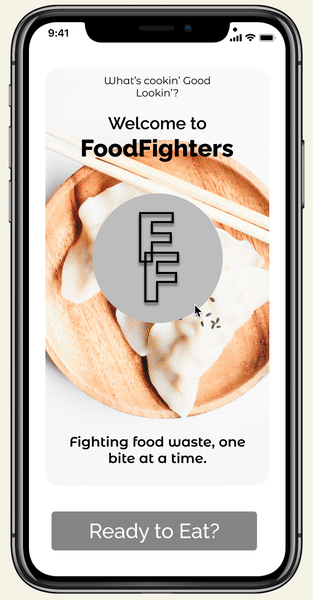
From my content perspective, I wanted to ensure that the young, fresh voice our client had in mind for the app, really came through:
I included quirky quips such as:
“What’s cookin’ Good lookin" and
"Fighting food waste, one bite at a time” at the onboarding screen
I added large images of varied dishes of food, to help to give the app an overall modern and youthful appeal as well.
Order Up!
Delivering Solutions
Low Fidelity Prototype
We learned a great deal about our product during our usability testing period:
Problem:
Customers cannot see themselves represented on the interactive map to understand their relative location to suggested restaurants.
Solution:
An indicator to represent the customer's location on the interactive map was added.

Home Screen v.3

Home Screen v.4
Problem:
Customers were unaware that the food genre choice carousel was a scrolling feature.
Solution:
Visual indicators were added below the food carousel to notify customers of the ability to scroll.

Home Screen v.3

Home Screen v.4
Problem:
There were few call-to-action buttons on the checkout page to guide customers through the checkout process.
Solution:
Food receipt option buttons and order call to action buttons were enlarged, quantity choice toggles were added to the order summary section, and additional payment options were added, as well as making payment buttons more prominent visually.

Home Screen v. 3

Home Screen v. 4
Simple Tastes
Super Easy to Select a Restaurant and Order Food!
– Usability Test Participant
I created a treejack assessment to conduct a heuristic evaluation of our prototype's attempt at consistency throughout the design.
Enhancing the Flavor
Future iterations
For ongoing iterations; more attention is needed to ensure the message of food sustainability and environmentalism is carried out more throughout the entire app, rather than just at the open and close of the user's experience.
Continued attention to accessibility is also needed to ensure that as visual design is incorporated into the app, the content remains legible and easy to view for all customers.
Our customers expressed the following during usability testing:
"The message at the end of the check out made me feel good about the purchase I was making!"
– J.T., Usability Tester

Final Thoughts
What I learned during this process:
I quickly learned how to move with a team in an agile state; my first experience!
I discovered there is no “right” process to follow to design; just always keep the user in mind.
I discovered that in design, intent needs to be explicit, or it will be missed, like our message on sustainability.
I'm more passionate about food sustainability than I realized, and would love to pursue ways to make a difference in the world with this issue in the future!