
MoCi City Transit
Designing a Better Public Transportation App
Role:
UX Designer
UX Researcher
Team:
Boot Camp Instructor:
Monica Longmire
Tools:
Figma
Adobe Photoshop
Constraints:
4 weeks
The Story
Midgar City Transit Authority (a mid-sized city located in the midwest) is expanding! The MCTA desperately needed a new app to help riders navigate the seven additional bus lines added to the system. The new app would encourage riders to develop new, more efficient habits when planning for, tracking, and riding on a specific bus trip.
Problem:
MCTA riders were unhappy about the confusion the additional seven bus lines created; particularly around the already busy Washington & State street stop. MCTA wanted to provide an MVP app that would notify riders about how far away their bus was from them, when it had arrived to their specific stop, and when they could expect the next bus on the same line.
Solution:
I successfully created an MVP app that satisfied both the business requirements and riders' needs. The app allows riders to locate a specific bus at a particular stop, out of a list of 7 possible bus lines. Riders are also able to set an alert for a bus in order to track its distance from their specified stop and receive notification of its arrival to their stop.
Driving Around the Issue
The Research
I conducted a user survey of over 60 public transportation riders. I also interviewed 3 of the survey participants to learn more about their sentiments surrounding public transportation apps.
83.9%
82.1%
96.4%
85.7%
“Let me know if something is running or not, so I can make alternative arrangements if needed.”
– D. Austin, MCTA Rider
Personas
Kira and Ned were personas of MCTA riders that I developed based upon user research. Although Kira represented younger, more tech-savvy riders, and Ned represented older, more traditional riders, both Kira and Ned wanted transparency of information from the transit system app above all else. They both also wanted to have an easy-to-use app to be able to track the punctuality of a bus at any given stop, and receive alerts when their bus arrived.


Driving at the Point
Defining the Problem
I completed a competitive analysis on two similar public transportation apps: Google Maps and DC Metro.

DC Metro

DC Metro Trip Planner
Google Maps Trip Planner

Google Maps
From my analysis, I found an opportunity to provide riders with need-to-know trip planning information without overwhelming them with visuals, as well as a chance to incorporate real-time alerts to notify riders of their bus's location.
User Flows
I made several iterations of a user flow for my app. My initial flow was too general, leaving riders with little choice of how to find their bus. It also neglected the feature that would allow riders to save a particular bus in order to enable an alert for its arrival. I also later learned after some usability testing that the second and third flows were far too complicated with too many rider view options that became confusing to follow.
User Flow 1
User Flow 2
Wireflow v.1
My current wire flow iteration (Wireflow Iteration 3) takes into account the personalized feature giving rider's the capability to be alerted when their bus is pulling into their preferred stop, but this flow is an exercise in progressive disclosure as I reduced the number of view options for the rider from four to two: a map view and a bus stop list view.
Wireflow v.3
All (the ideas) Aboard!
Developing Solutions
Sketching Around:
I first began my ideation process by sketching out a variety of view options for the screens I identified as necessities in my user flow. I immediately began reducing redundancies and looking for ways to minimize confusion for riders.
Problem:
Riders have varied needs when it comes to how they prefer to access the transit system information. Riders like Ned prefer to look at a bus system schedule to plan, other riders like Kira are more comfortable with typing into a search bar.
Solution:
Provide riders with various views to access their bus system information.
Problem:
Riders want to know when their preferred bus arrives to a stop.
Solution:
Incorporate an alert feature that allows riders to select a bus and a notification time of when that bus arrives to a specific stop.
Problem:
Riders are overwhelmed by too many view options and screens from my first wireframe and prototype.
Solution:
The userflow and wireframes are streamlined through iteration to combine features into less screens. The map view and search view are merged to create the home screen for the app, the bus stop view and bus list view are merged as well. The cognitive load for the rider is reduced significantly.

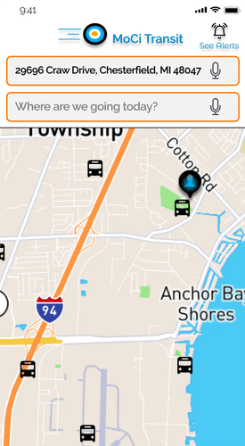
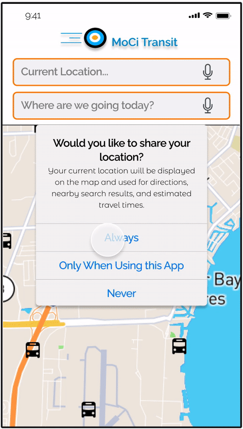
Interactive Map home screen
Problem:
Riders find that the “Search by Bus Stop” is not an intuitive method by which to plan a trip
Solution:
The map on the home screen becomes interactive, allowing riders to view the bus stops and landmarks around their GPS location. This feature is more exploratory in nature and provides more visual cues that align with riders’ schema using transit apps (icons shaped like a bus to represent bus stops) and also provides a more intuitive method to navigate the app and plan a trip.
Visual Identity

Moodboard

Logotype
I wanted to evoke a feeling of energy with an overall sense of trustworthiness for my app. Bright orange provides the app with a youthful vibrancy that expresses the frenetic energy involved with being in motion, as most riders are when moving between their destinations. Bright blue lends to the energetic, youthful feel as well, but blue also evokes a sense of calm and responsibility; sensations I also wanted to evoke in the bus brand I created. The logo encompasses these color theories and also incorporates the symbolic movement of a rolling wheel, to further emphasize the efficiency of the transit line.
Last Stop!
Delivering a Solution
Through usability testing of my current prototype:
• I learned that the overall youthful and energetic feel and mood of my app were successfully conveyed through my branding.
• Riders were able to successfully use the search feature to identify an ideal bus route to a specific location, and they were also able to successfully set an alert for a specific bus at a stop
• Riders indicated a desire to see more information in the app to help with their understanding of the bus’s ETA and in creating an alert for a bus.
• Riders want more visual cues to help them navigate the home screen’s interactive map feature; many did not realize the map was interactive and scrollable at first.
In retrospect,
I would have begun testing my design much earlier in the process, either through paper prototyping or earlier during my wire framing phase, in order to catch some of the issues riders discussed with me during usability testing.
Final Thoughts
• The most powerful lesson I learned from this project was the impact of progressive disclosure on design. I became very aware from the testing and feedback of my prototype that more information is not always better, especially when it comes to app design.
• I learned from this project that it is important to balance my "teacher tendency" to provide as much information as possible with my developing designer skills to provide a simple and easy-to-use product.
