
Finding Community in Scratch
A Redesign Project
Role:
UX Designer
UX Researcher
Team:
Mentor:
Alisa Le
Tools:
Adobe XD
Figma
Adobe Photoshop
Constraints:
4 weeks
The Story
Before starting this project, I was already very interested in the process of community building within learning environments. I am a former 4th-grade school teacher and community building within my classroom was a very integral part of my pedagogy. Simultaneously working on this project and also finishing my Master’s in Education, gave me the opportunity to delve further into the academic research surrounding the importance of community building in places of learning. I was always interested in working with technology and encouraged its use daily with my students in my classroom, and, given the global pandemic and the growing need for distance learning, I was interested to learn more about how teachers and parents could encourage community through technology. I am also deeply invested in encouraging diversity within the STEM field, particularly within Tech, and the bulk of my research was also dedicated to understanding why there are so few minorities within the field now, and ways that diversity can be increased and encouraged to eliminate this issue in the future.

My graduate research led me to Scratch. Scratch is a website built by M.I.T. to help kids learn how to code. It gamifies the learning process and encourages the creativity of building with code within a low to no risk, communal environment. The site emphasizes how much it values community however, as I began to delve more into the features of the site, I noticed some design discrepancies that seemed counter to these claims.
Problem:
The Scratch site was created to encourage collaboration and creativity in learning how to program and code. I found, however, that the community features of the site were disjointed and often lacked ease of accessibility for users. My goal for this project was to create a better user flow for learners to access the varied community features of the Scratch website. I wanted to make these features more accessible and more discoverable to learners in order to better foster the community the Scratch team insists is an integral part of their mission.
Design Solution:
What I was able to develop was a prototype that meets the MVP qualifications I established at the start of my project, based upon my user research:
A site with easy access to community features from the Community Highlights page.
A site with quick access to a mentor or subject-matter-expert when stuck through the discussion boards.
And readily available visual resources (videos, tutorials, and guides) found on the tutorials page.
Looking for an Ice Breaker
The Research
Although I came to this project with a great amount of academic research under my belt, I wanted to collect quantitative and qualitative data as well to better guide my project goals. I began with a short survey sent to parents, teachers, and individuals who have experienced online and distance learning, to learn more about their thoughts on building learning communities through technology. With my limited time to complete this project, I was only able to survey 20 people and collect feedback from 2 interviews.
What I found from this initial survey is that the majority of participants encourage their children or students to work within groups and they prefer working with others themselves as well.
“I like having a community to be there if I need help, but dislike required interaction.”
-Survey Participant
“My young students crave the social interaction.”
-Teacher Survey Participant
After collecting feedback from my survey participants, I also wanted to learn more about how the community in Scratch was being perceived by actual users currently.
Initial Usability Testing:
I conducted a usability test of the current Scratch site with a focus specifically on its community features. I gave my participants a few simple tasks to see how well designed the site’s community features currently are for usability.
For example, I asked participants where they would look on the home page to find and interact with work made by others within the community. My participants scrolled to the bottom of the home page to the section titled "What the Community is Loving".
When asked where they might look to find the Discussion Boards feature of the site, participants looked immediately to the website's header, instead of the site's footer where the link to the boards was actually located.
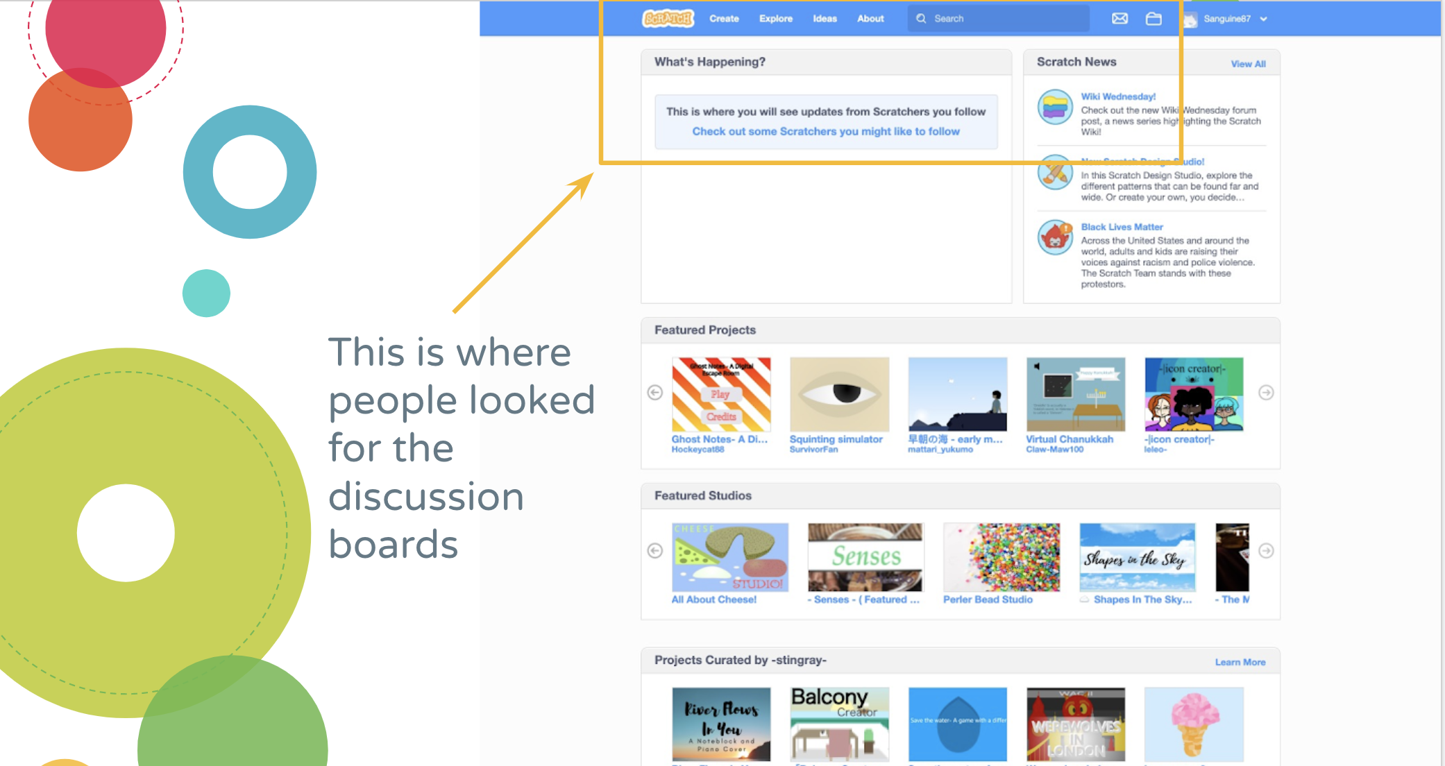

I then asked participants where they might go to initiate a collaborative project with other Scratch users, and there was general confusion about how to complete the task on the site. Participants did not understand that Studios were collaborative spaces where programmers can build projects together.
Research Takeaways:
For a great majority of my participants’ community is essential to quality learning. Even in my academic research, I discovered that inclusive communities of practice within the tech field encourage not just women and minorities to feel safe in their pursuits of their interests, but all members of that community benefit as well. Inclusive communities of practice encourage judgment-free collaboration and an environment where mistakes are welcome learning tools.
People want to collaborate and communicate with others while learning, but only if it is on their own accord and not forced upon them.
I also found that people want fast and easy access to others who can help them through difficult materials, a subject-matter-expert, or a mentor of sorts. People also like to learn from visual aids like video tutorials and step-by-step diagrams. Many of my participants identified themselves or their children and students as “visual learners”
Warming Up the Crowd
Defining the Problem
User Personas:
From my research, I developed two personas that encompassed the needs, personalities, and stories of my participants.
Nora: a 3rd grader who loves to code after being introduced to it the previous year by her School Librarian. She just wants a fun, safe space to learn coding online with her friends, build games and other cartoons, and interact during socially distanced Covid times.

Sasha: She is both a mom and school teacher so she knows how important tech skills are in the 21st-century workforce. She wants to give her kids all the resources she can to help them succeed (both in the classroom at home). She needs a site that makes learning for her kids and her easy and has a community that is easily accessible when she can’t figure things out on her own (or how to teach it to her students).

Based on my research and initial usability testing, these are the themes that resonated the most with my participants:
Learners want easy access to communicate and collaborate with others when they choose to.
They want quick access to connect with someone who may know more than them about a tricky topic, or challenging material in order to get help from them.
They also want easy access to videos and step-by-step guides to help them learn and work through challenging materials as well.
How Might (I): My "North Star" to guide my work during my process was "How might I improve the site’s design to help make the community features of this site more accessible to young programmers?"
User Flows
To get a better understanding of how learners found the community features of this site, I quickly sketched a user flow to represent how people currently flow through the site.
To improve the flow I sought to centralize the community features of the site onto one Community Highlights page. This page would be customizable to the user’s preferences and it would highlight some of the goings-on within the community in one place for the user.
Nora's Flow:
The flow would be similar for both Nora and Sasha (in order to minimize issues when Sasha, as the teacher attempts to walk Nora through the site). Nora would see the things other students and community members are working on.

Sasha's Flow:
Sasha would be able to have a focalized view of her students' work and their class discussions.

Site Map:
I then developed a simplified site map to guide my process as well, incorporating a “Community” tab in the site’s header, from which all the community features would stem from.

Altogether Now-(Re)Building A Community
Developing Solutions
Sketches:
I sought inspiration from various places online to start creating my sketches for this project: I looked at video streaming sites like youtube, discussion boards, and forums as well as online learning communities.
I wanted to keep to the design of the site, but explore creative ways to encourage more collaboration between learners.
Individual Projects Page • Studios Page
Settings Page
Tutorials Page
Search Feature
Discussion Boards • Community Home Page
Community Home Page
Studios-Shared Workspace and Files
Studios-Shared Workspace
Discussion Boards
Pain Point 1: Community features were spread out haphazardly across the site.
Design Solution: I kept Sasha and Nora in mind as I began to build my wireframes. I wanted to create a centralized location for all the community features and highlights that learners said they were looking for, but having a hard time finding on the site. I moved the community tab to the header and made a splash page of community highlights.

Nora’s (Student) Community Highlights Page

Sasha’s (Educator) Class Community Page
Pain Point 2: Learners like Nora were confused by the Studios feature of the site, not realizing they are meant to encourage collaborative work.
Design Solution: I explored new ways that current screens could be reimagined to help better guide learners’ experiences with the site, as well as still encourage collaboration. I incorporated the discussion feature of studios on to the workspace page, to create a virtual "whiteboard". Nora can then see the changes and progress of her team’s shared work simultaneously with their running communication below.

(Team) Studio Page: A new way to collaborate
Pain Point 3: The discussion boards were buried in the footer of the home page and difficult to find. They were also visually overwhelming.
Design Solution: I moved a summary of the discussion boards to a central location (located now on the Community Highlights page) I also worked to reduce the cognitive load and simplify features to encourage learners to make more use of the discussion boards.

Discussion Boards v.4
Pain Point 4: Learners requested easier access to visual aids to guide their learning. They wanted to be able to watch video tutorials to help guide them through difficult skills and strategies. The Scratch community has a Youtube channel, but no connection to that channel or its videos on its main website.
Design Solution: The video tutorials page provides a central location for learners to access step-by-step guides as needed. A summary of available tutorials was also placed on the Community Highlights page, to help learners see popular topics that the community is learning.
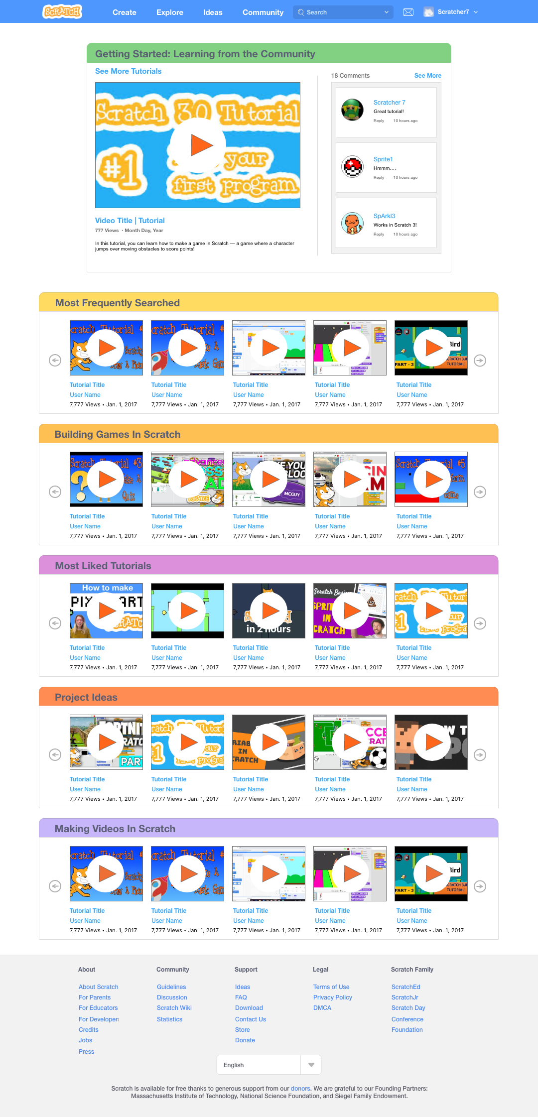
Tutorials Page
Making the Social Rounds
Delivering a Solution
High Fidelity Prototype
Usability Testing:
After building my prototype, I wanted to test the usability of my redesign. I returned to my original usability test participants to ask for assistance. I asked my testers to complete similar tasks to my first usability test:
"Where would you look to find more projects from the community?"
Testers accurately selected the "Community" tab in the header of the home page.
"Where would you look to find video tutorials to help you?"
My participants immediately selected the "See more tutorials" section of the tutorials summary box on the highlights page.
They were also able to easily locate the discussion boards page now from the highlights page and they liked the simplification of the page that allowed them to browse entries by category, by tag, and by selecting specific threads to open and close responses from view.
There was still difficulty surrounding understanding the purpose of and accessing the Studios feature of the site from the highlights page, however. Although I included the term "team" to Studios, some testers were still not aware of the collaborative nature of the feature.
After these results, I included the "team" icon from the studio's workstation to the Studios summary on the community highlights page, in an effort to provide a stronger visual indicator of the collaborative nature of the feature. I still believe more work will need to be done to redesign and visually redefine the studios feature to make it more accessible to learners.

Future Iterations:
I plan to re-work the design of the Studios feature to find a stronger visual design that will clarify its collaborative functions.
I also plan to improve the Educator/Class view to include a Teacher Community where educators can collaborate and exchange ideas together as well.
Finally, I eventually would like to explore ways that learners can share ideas and information via live chat on the site, similar to other sites like Flipgrid.

Final Thoughts
What I learned during this process:
Community is Essential:
Now, more than ever, community is incredibly important for our social, mental, and even physical well-being. People crave social interaction, prefer it, and most learn best within safe, inclusive communities of practice.
Don’t be afraid to Explore!:
I had to learn to let my inhibitions go with a redesign, learning that it is OK to challenge current design systems if it means that functionality will be improved. I learned that although a site may have a well established design system, there are still areas for exploration available where designers can innovate while still maintaining a sense of the original system.
Note: I do not work for, nor am I affiliated with, Scratch. I did this UX case study as I am a product designer who likes to solve problems, and as a former teacher, Scratch is a fantastic site that has helped my students greatly in learning how to code and program.